王尹瑄、凌薇、陳孟筠、劉家妤、王品傑 - Wang Yin-Xuan, Ling Wei, Chen Meng Yun, Liu Jia Yu, Wang Pin Jane
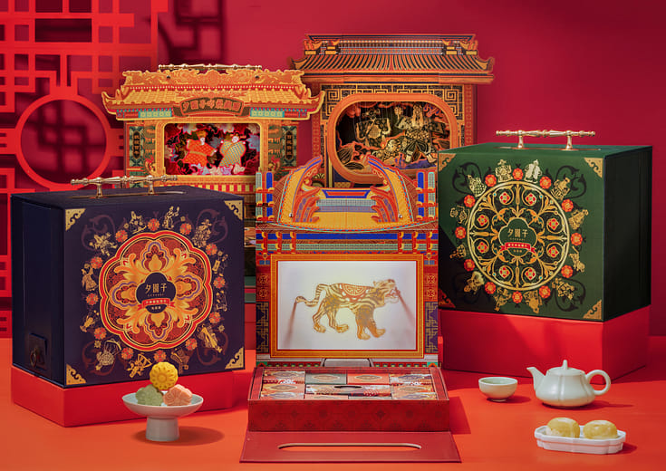
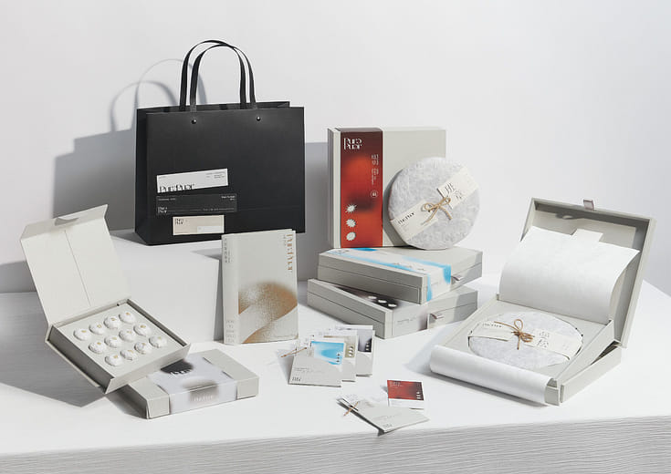
隨著時代發展,大眾對求子的需求式微,註生娘娘信仰也逐漸沒落,因此我們想藉由年輕化的神祇角色插圖,結合書籍裝幀與周邊設計,規劃成完整的註生指南,傳達出現代與傳統文化的連結。整體設計以紅、黃為主色調,詮釋東方傳統文化特色。而包裝卡榫處則以蛋型進行設計,「蛋」除了象徵圓滿無缺外,又取 『蛋生雞,雞生蛋』的意義,凸顯出同註生娘娘所帶有的生命循環不息之吉祥觀念,打開包裝後所見到完整的蛋黃,則象徵新生兒順利產出,藉由特殊包裝設計呼應本專題的主題,傳遞希望產婦順利產子的祝福。利用簡單有趣的方式以便大眾進行了解,同時重新喚起現代大眾對神明文化的興趣。
-
As time goes by, the birth rate has declined, and the belief in the Note Birth Empress has gradually waned. Therefore, we design a complete birth note guide through younger style illustrations of birth-related Goddesses, combined with book binding and peripheral design, to convey the connection between the present generation and traditional culture. The overall design employs red and yellow to interpret the characteristics of Oriental culture. The packaging tenon is designed in the form of an egg. "Egg" not only symbolizes perfection, but also takes the meaning of "giving birth to chicken, chicken giving birth to egg", the auspicious concept of the endless life cycle. The complete egg yolk seen after opening the packaging symbolizes the smooth delivery. Through the packaging design, it echoes the theme and conveys the blessings of smooth delivery. We design in a simple and interesting way for the young parents to learn and know, while at the same time, to arouse their interest in the divine culture.